The first Toronto Maple Leafs logo change in nearly 30 years has been unveiled.
The Maple Leafs have unveiled their new logo. #TMLtalk
MORE: https://t.co/KRmipfd2uJhttps://t.co/6JxhtUCxaI
— Toronto Maple Leafs (@MapleLeafs) February 3, 2016
This is the official new logo for Maple Leafs and the Marlies for next season. pic.twitter.com/uxZex5mrmX
— James Mirtle (@mirtle) February 3, 2016
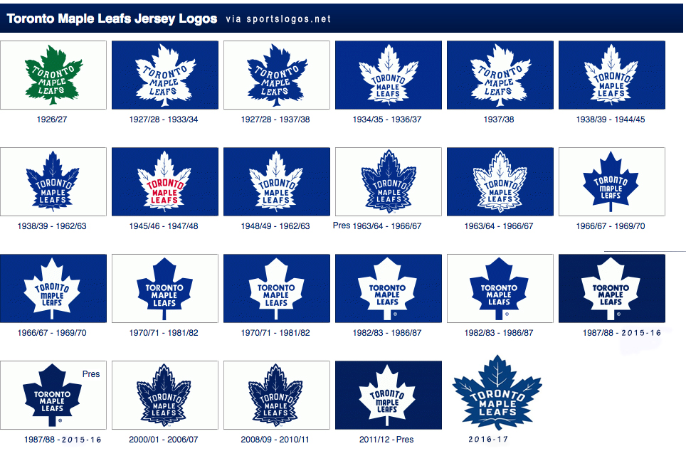
The design, which becomes the official primary logo in time for the Leafs‘ centennial 2016-17 season, is a modern update on the 35-point Maple Leaf worn by the team between 1938-39 and 1962-63 — the winningest “jersey era” in Leafs history, featuring eight of the franchise’s 13 Stanley Cup championships (including the St. Pat’s).
The new logo contains 31 points, meant to represent the date (1931) Maple Leaf Gardens opened.
The era of the dark blue 11-point Maple Leaf — which was their primary logo between 1987-88 and 2015-16, seeing zero Stanley Cup Finals along with the lengthiest playoff drought in franchise history — is over. And hopefully the losing tradition of the past 28 years goes with it.
New management, new coaching staff, and now a new logo.
Shanny’s Letter
Brendan Shanahan's letter to Leafs fans about why they are changing the logo pic.twitter.com/f1Q2Sx8VrR
— James Mirtle (@mirtle) February 3, 2016
Updated Leafs Logo Timeline
Leafs logos by winning percentage
Here’s a great visual breakdown of the Leafs‘ results by jersey era courtesy of Sportsnet:

1938-1963 designs


The late Ted Kennedy — the last Maple Leaf to win the Hart Trophy as the league’s MVP — won five Stanley Cups in this era of the logo.

The outline layer isn’t present in the new design, but the veins within the Leaf logo are back — 13 along the top, representing each Leafs Cup win, and 17 total as a nod to the franchise’s inaugural season — and so is a similar, but modernized, typeface.

Here’s to Mitch Marner, William Nylander, Morgan Rielly and company leading the team on deep playoff runs adorning this new logo on their chests.
An organization with the Leafs‘ storied history is always taking a leap making such a change, but consensus online seems to be that the organization hit the sweet spot between tradition and modernity with a sharp new twist on a classic logo. What say you?


![John Gruden after the Leafs prospects’ 4-1 win over Montreal: “[Vyacheslav Peksa] looked really comfortable in the net… We wouldn’t have won without him” John Gruden, head coach of the Toronto Marlies](https://mapleleafshotstove.com/wp-content/uploads/2025/09/gruden-post-game-sep-14-218x150.jpg)


