If you are not yet aware, I have recently launched a new hockey statistics website at Puckalytics.com. Long-term this will be the replacement for stats.hockeyanalysis.com, but not all features are implemented yet; for now, both will remain operational. There are some new statistics available at Puckalytics.com and one of those features is the ability to find the percentage of a team’s overall statistic that the player was on the ice for. I call these ‘% of Team Stats’ and they can be found here.
To explain exactly what these statistics mean, let’s look at % of Team TOI. Last season, Ryan Suter led the NHL with a 5v5 % of Team TOI of 44.98%, which means in games that he played in he was on the ice for 44.98% of all the 5v5 play. He also had a 5v5 % of Team GF of 46.92%, which means in the games he played in he was on the ice for 46.92% of all goals scored by the Wild during 5v5 play. As we can see, Suter was on the ice for a higher percentage of the goals for than ice time (a good thing). He also has a % of Team GA of 42.24%, meaning he was on the ice for a lower percentage of the goals against than 5v5 ice time. This is also a good thing. This is really just another way of looking at on-ice performance relative to the team.
Now, what I did was look at the Maple Leaf forwards to see how their % of Team GF compared with their % of Team TOI over the past 3 seasons during 5v5 play. I did this by comparing the ‘ratio of % of Team GF’ to ‘% of Team TOI.’ This tells us how much offense was produced relative to both their teammates and to how much ice time they were given. Numbers above 1.00 mean that more offense was produced during their ice time than their average teammate and numbers below 1.00 means less offense was produced.
Now, what this doesn’t tell us is how directly involved the player was in that offensive production. To account for this, I looked at their individual points percentage: The percentage of the goals scored while the player was on the ice that the player had a point on (i.e. scored the goal or assisted on it). The higher the number means the more directly involved in the offensive production the player was.
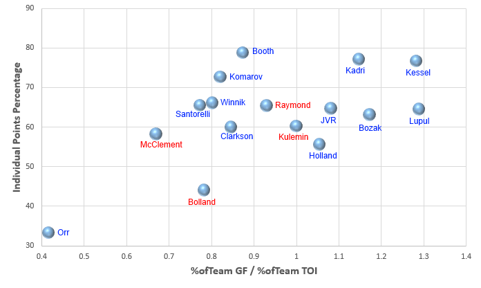
To visualize this, I plotted % of Team GF / % of Team TOI on the x-axis and IPP on the y-axis and got the resulting chart.
The player in red departed the organization since the last season ended. Players in blue are players currently with the Leafs organization. So, moving left to right means the player was on the ice for a higher rate of goals relative to their team mates and ice time. Moving bottom to top means the player was more directly involved in the offense.
There aren’t really a lot of surprises here, but it is interesting to see it visualized. Not surprisingly, Orr is terrible. Kessel is awfully good and Kadri looks pretty good, too. A lot of people have been critical of Bolland and are glad to see him gone; this chart certainly supports that sentiment. His IPP is very poor. I am not convinced that letting Kulemin and Raymond go was a wise move, but Booth’s IPP is really good and he might be a decent fit for second line duty… probably better than Clarkson or anyone else at this point.
All that said, while the Leafs might have a better 4th line this season, it remains to be seen if their forwards will be improved overall.


![John Gruden after the Leafs prospects’ 4-1 win over Montreal: “[Vyacheslav Peksa] looked really comfortable in the net… We wouldn’t have won without him” John Gruden, head coach of the Toronto Marlies](https://mapleleafshotstove.com/wp-content/uploads/2025/09/gruden-post-game-sep-14-218x150.jpg)


